XYZ Films Brand Refresh
Unleashing Visionary Storytellers

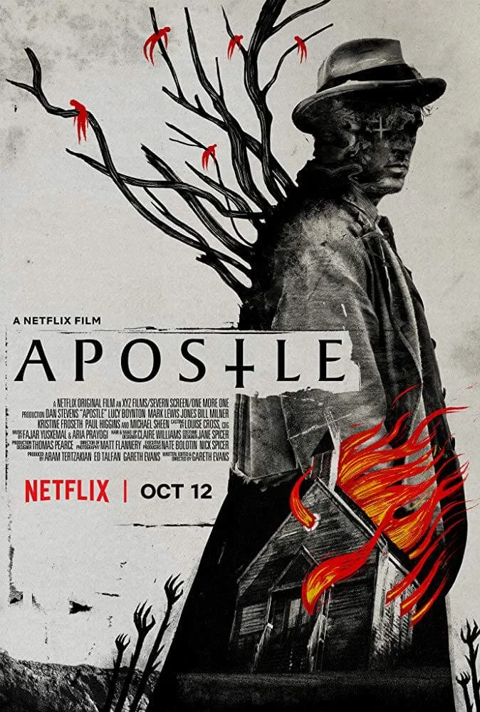
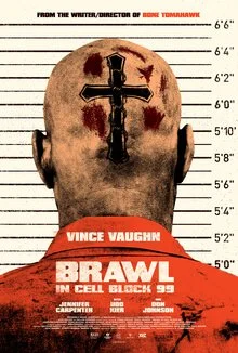
XYZ Films had built a cult reputation as a home for genre filmmakers — gritty, bold, and unapologetically independent. They needed a visual language that captured the angst, energy, and raw cinematic power of the films they championed.
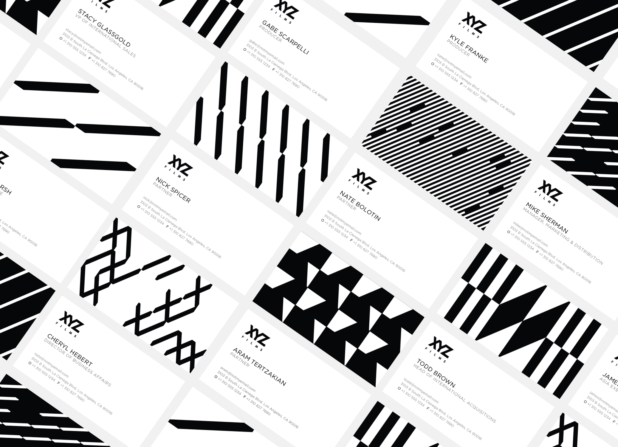
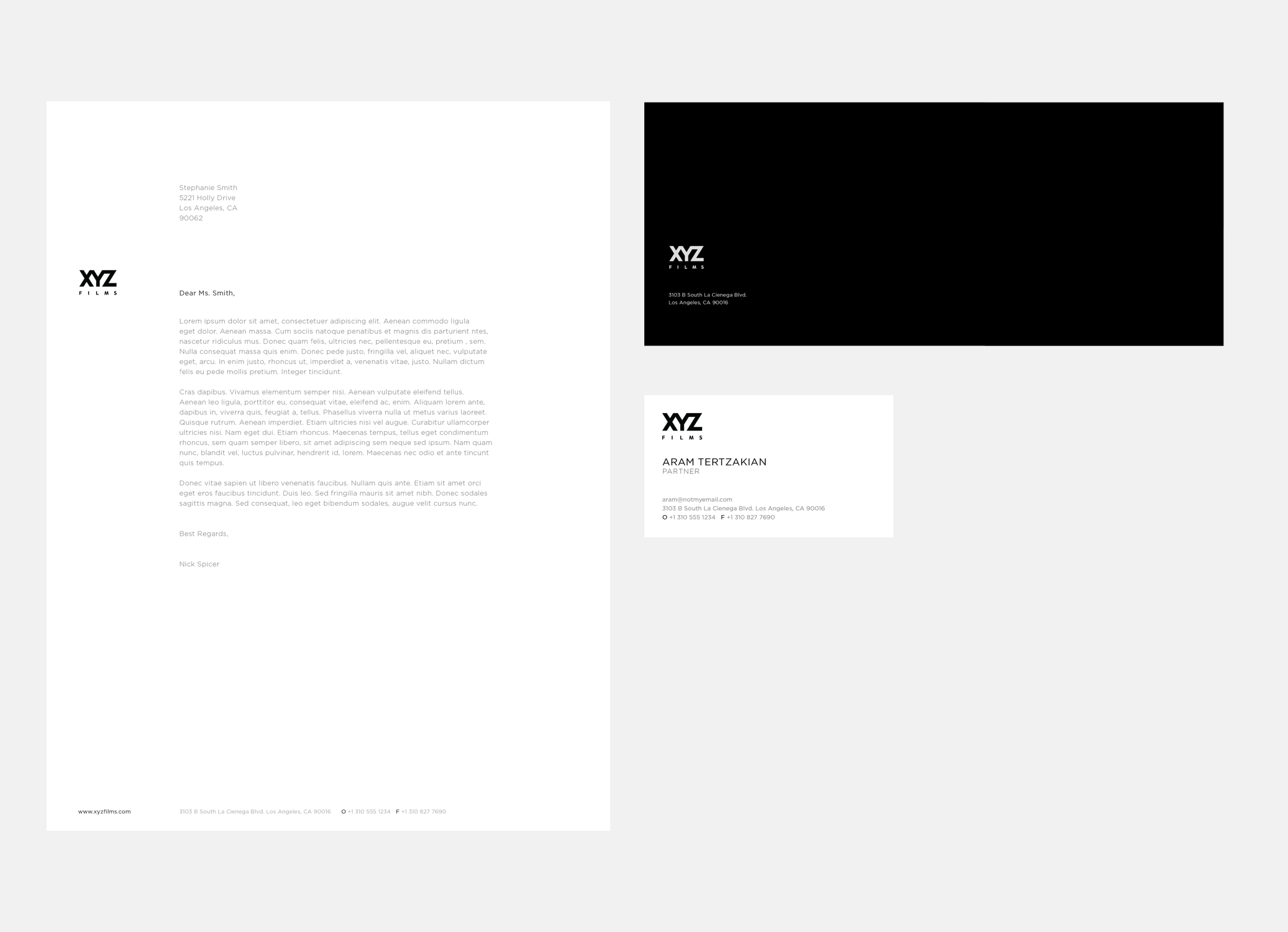
Went back to the source: black and white as the creative foundation with a custom system of geometric patterns designed to carry the angst, grit, and kinetic energy of genre filmmaking across various touchpoints. An identity system as bold as the films behind it.
Project Details
Industry
Entertainment
Year
2021
Deliverables
Brand Strategy
Lettering
Web Design
Graphic Design
Motion graphics
Client
XYZ Films


Original Brand Identity
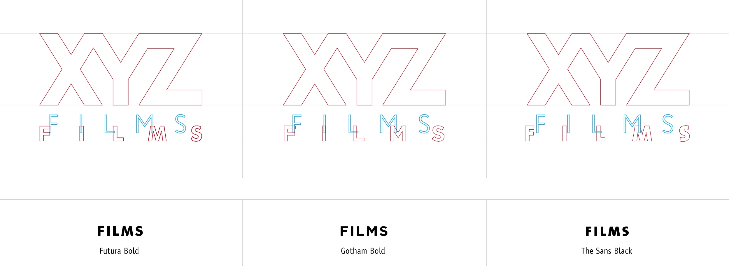
Wordmark Analysis
Original Wordmark
The angle of the diagonal strokes of the X and the Z is 59.73°, while the angle of the external diagonal strokes of the Y is 59.86°.
The current logo displays one grid unit between the diagonal stroke of the Y and the diagonal stroke of the Z. Meaning, the negative space between the strokes is intended to have the same width as the strokes. The same thing happens with the diagonal stroke of the Y and the diagonal stroke of the X. Visually it looks as if the negative space is narrower than the thickness of the diagonal strokes. It also adds some visual density that has proven to be harming readability in smaller sizes.
To keep the one grid unit between the diagonal strokes, the design had to adjust the X and create an uneven letterform where its upper half is shorter than its lower half.
The angle of the lower strokes of the X and the Z have been distorted to close in with the corners of the lower stroke of the Y. This is another feature that adds to the visual density of the logo.
Refresh Recommendations
Make the negative space a little wider.
Use the same angle for the diagonal strokes of the X, Y and Z letterforms.
Keep an even X letterform which will help in releasing some of the density of the logo since it will push the X and the Z outwards.
Keep the same angle for the diagonal strokes of the X, Y and Z letterforms. This will help in removing the visual density of the current logo.
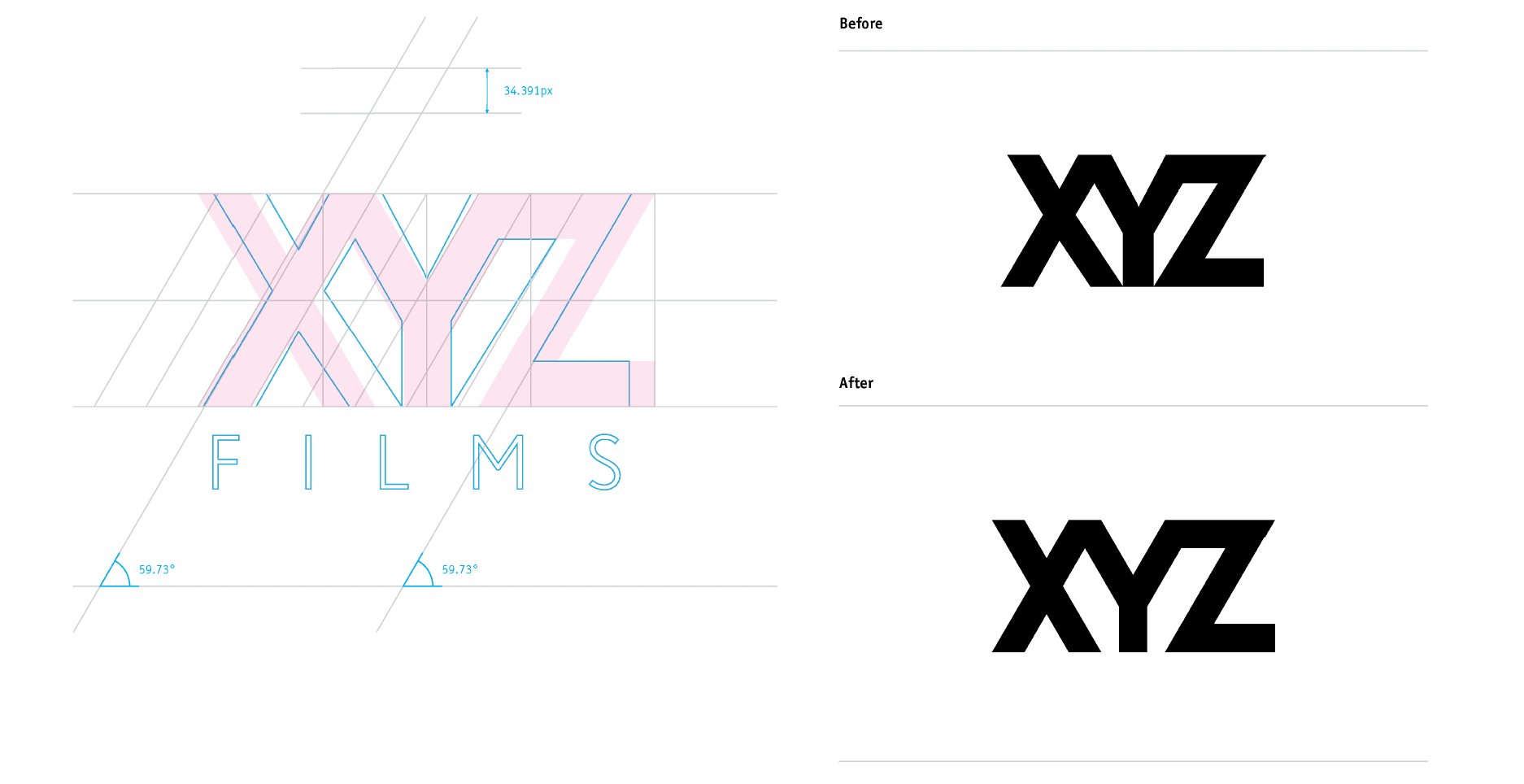
“XYZ” lettering refinement
“Films” Font Update
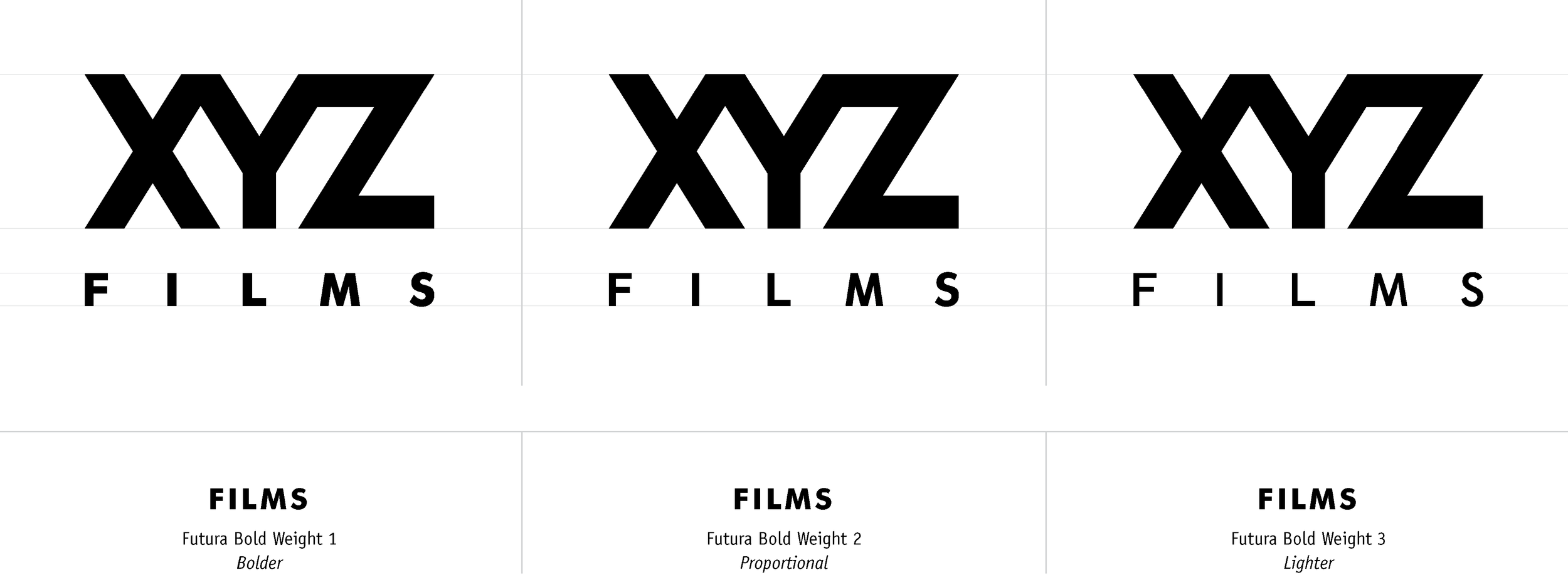
“Films” Font weight variations
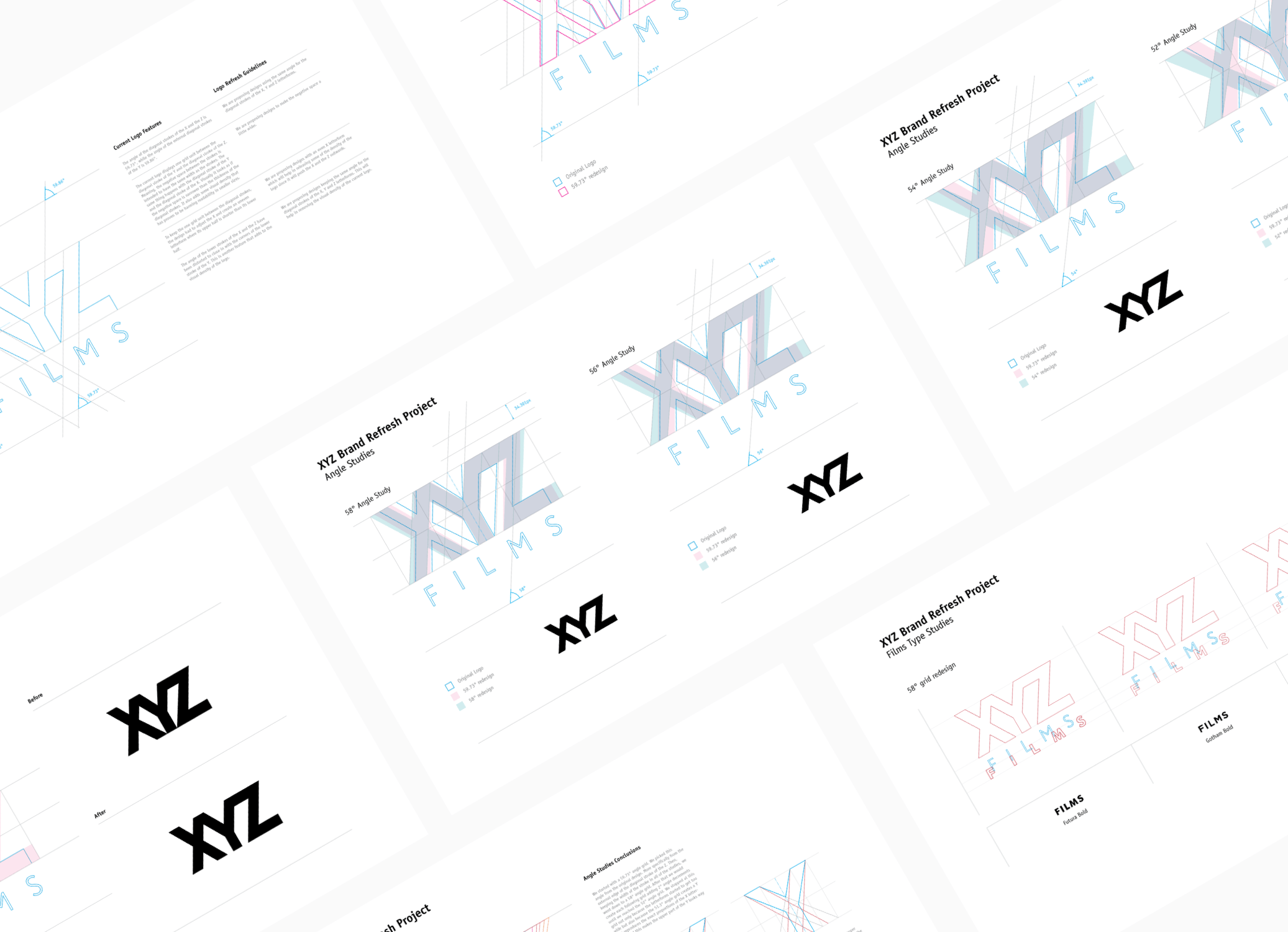
PRODUCTION LOGO

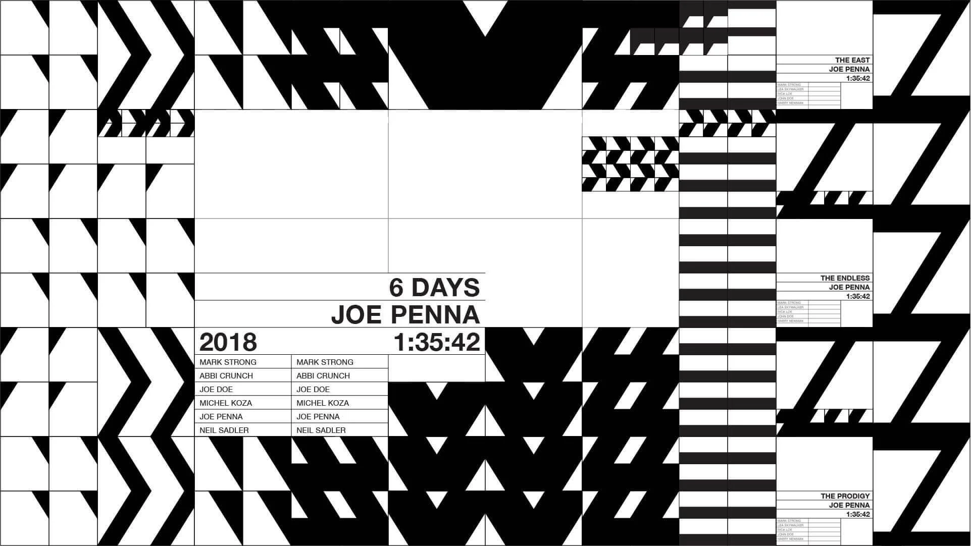
A SYSTEM OF CONTROLLED CHAOS
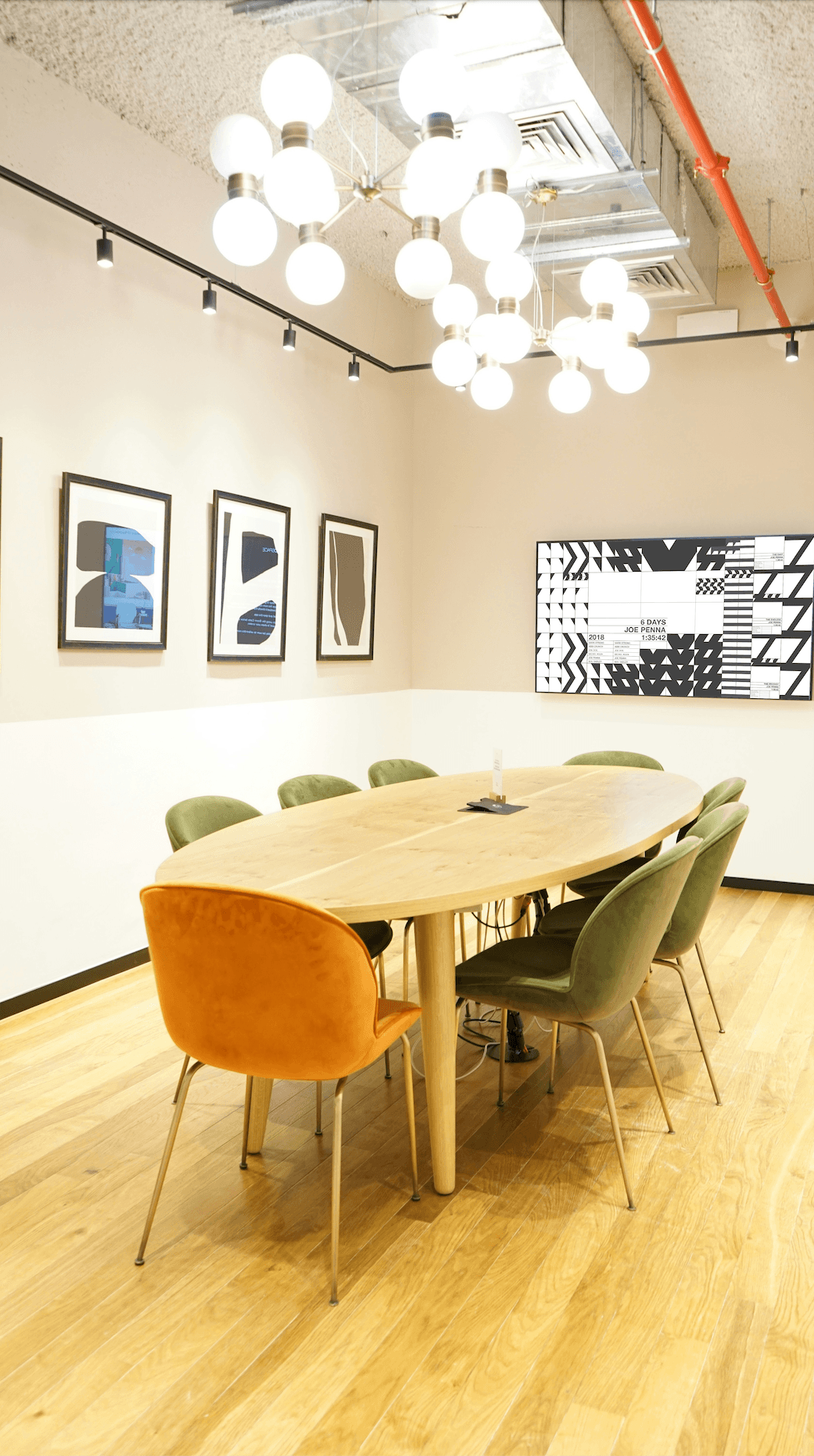
The geometric patterns were designed as an extension of the logo's DNA — angular, high-contrast, and kinetic. Built from the same diagonal energy found in the XYZ letterforms, the patterns give the brand a visual texture that scales from a business card to a conference room screen, carrying the grit and intensity of genre filmmaking into every touchpoint.
MOTION GRAPHICS TEST ANIMATION
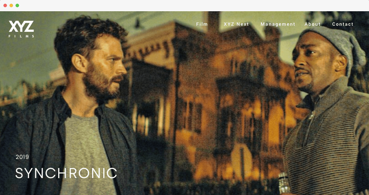
WEB DESIGN
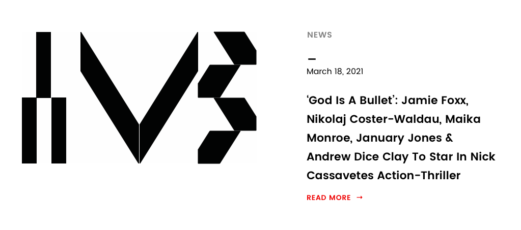
The homepage was designed to do one thing immediately: signal that XYZ Films is not a typical production company. A bold hero anchors the brand identity, while the feeatured film, news cards, and Coming Soon cards beneath it create a living front page that reflects the current slate at a glance, a cinematic in feel, built for easy updates by the client.
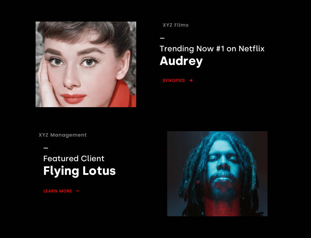


DESIGNING A VISUAL HIERARCHY FOR A FILM LIBRARY
To present three distinct content states — current releases, upcoming titles, and archival films, we developed a tiered display system tailored to the available assets and audience intent.
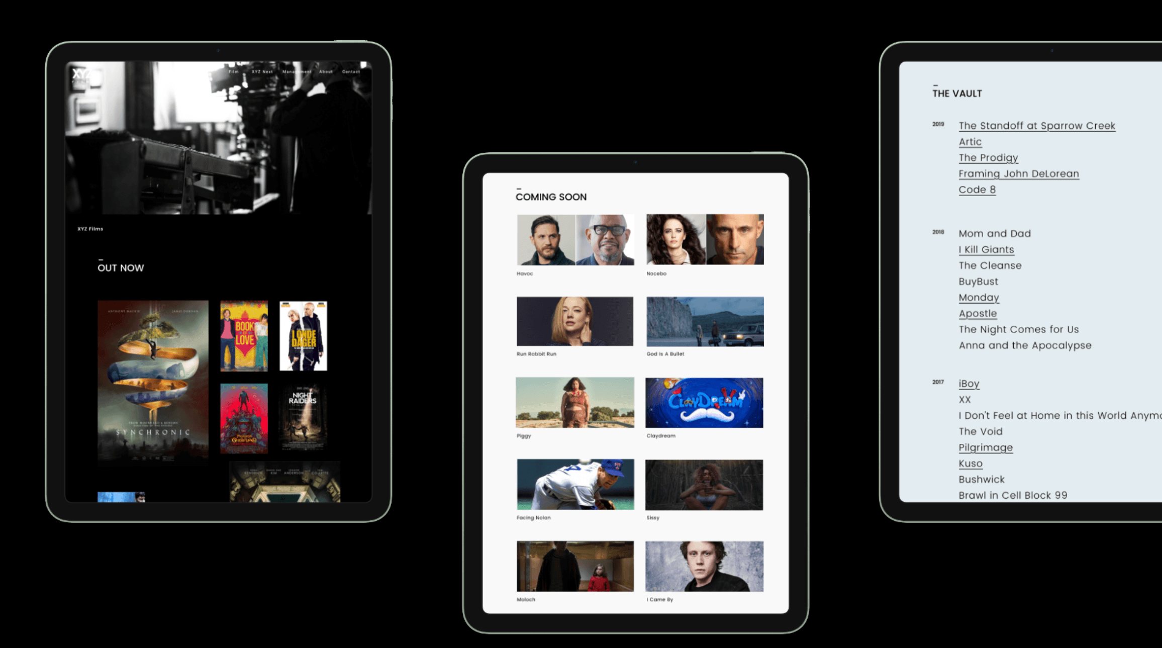
Out Now, titles are showcased with full poster artwork, leveraging rich visual branding to drive immediate engagement.
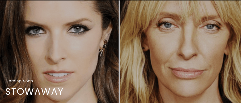
Coming Soon, where final poster assets may not yet exist, use production stills and on-set imagery to build anticipation.
The Vault, a clean typographic list organized by year lets the depth of the catalog speak for itself without competing visuals.
Each treatment was intentionally selected to match the content's maturity and available media, creating a cohesive yet differentiated browsing experience across the library.


Nauto Rebrand & Relaunch

odo by Sony. Future Product Concept