
Nauto Rebrand, Strategy & Design
Smarter, Safer, Data–Driven Driving
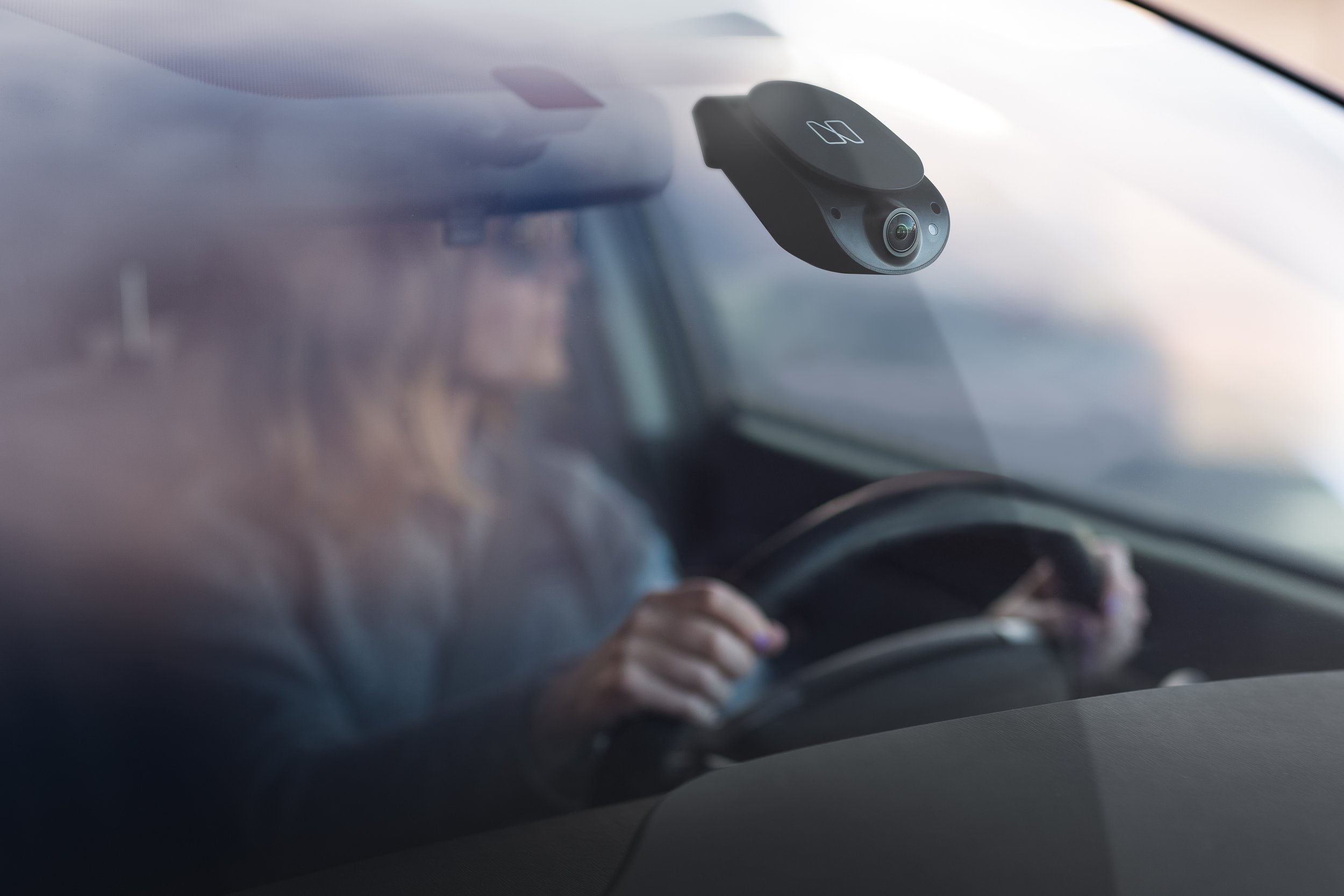
Nauto sat at the intersection of AI, fleet safety, and human behavior, a complex story that their brand wasn't telling. Generic and clinical, the identity didn't reflect the sophistication of the technology or the humanity of its purpose.
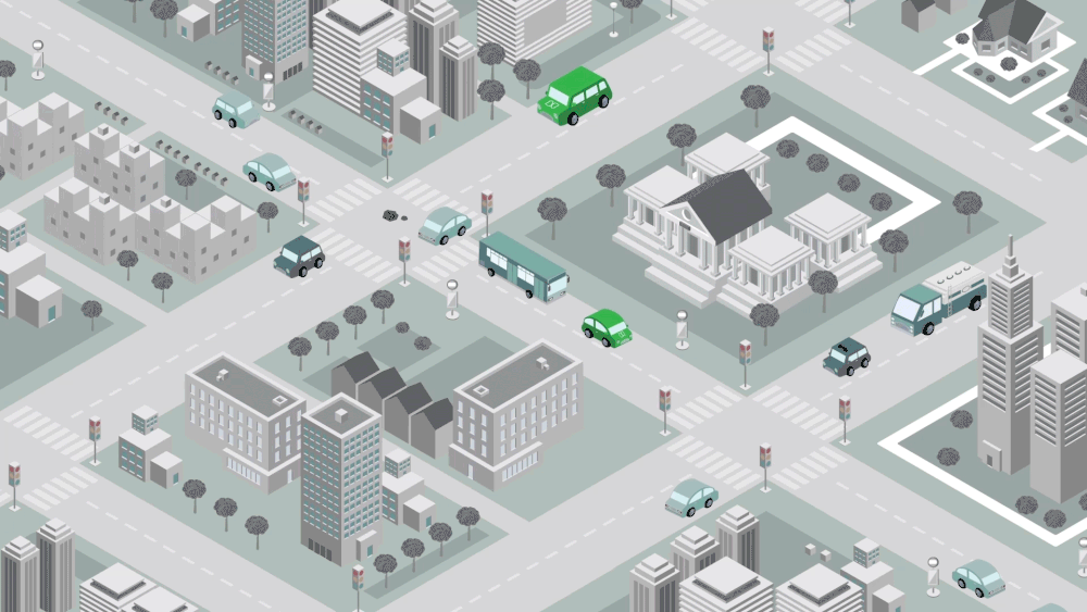
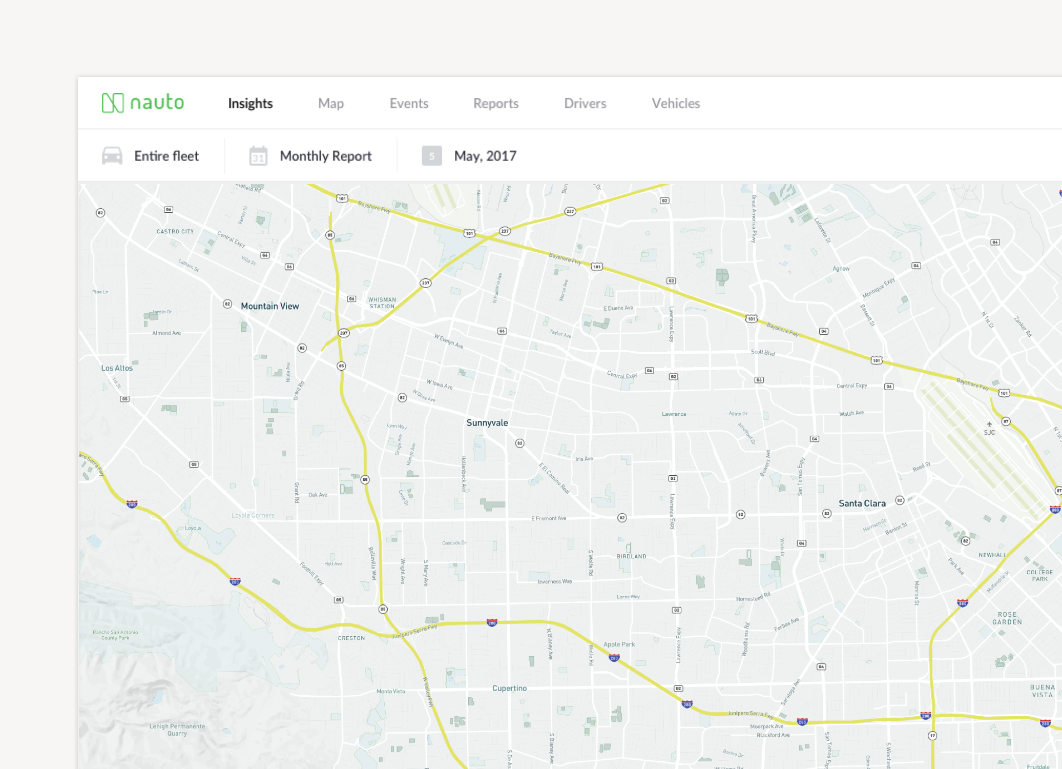
The concept reframed AI as a partner. Neon green broke the category's cautious defaults. A custom isometric illustration system made the invisible tangible, populating the brand with the streets, cities, and drivers the technology was built to protect. From dashcam packaging to enterprise fleet reports, the identity held. The rebrand contributed to $159M in Series B funding.
Project Details
Industry
Automotive
Technology
Year
2016-2018
Nauto
Client
Brand Strategy
Brand Identity
Brand Guidelines
Company Collateral
Marketing Materials
Mobile Installer App
Graphic Design & Packaging
Data Visualization
Auto-generating report tool
UX Product Design
Illustration
Deliverables

Original Identity

Identity Rebrand


Designed to Differentiate
In a fleet-tech category trained to look the same, corporate blues, industrial greys — neon green was a strategic break, designed to make Nauto unmistakable across every surface where it met a customer. Nearly a decade later, it's still the color the company leads with.


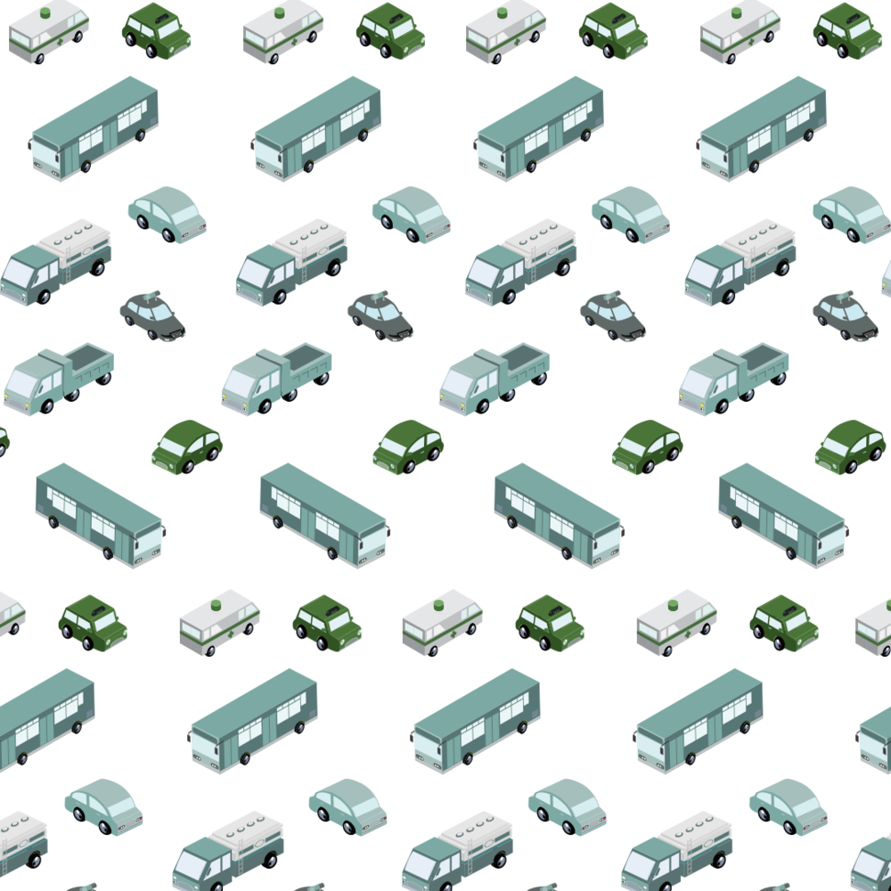
Where most startups of the era defaulted to the same flat-vector mascots and pastel humans, we built Nauto an isometric world — a connected system of streets, vehicles, and cities, rendered from above. It mirrors the way the product's AI actually reads the road: as an environment, not a cast of characters.
Sony Network Entertainment Research & Strategy

Doppler Automotive Service Design